
Scroll through any architecture feed and you’ll notice something interesting: the images that make you pause are often black and white. Not because they are nostalgic, but because they are clear. Without colour, buildings stop relying on surface appeal.
Black-and-white photography strips architecture down to its essentials, what remains is form, structure, and light- the things that actually define a building.
Before digital cameras and colour printing became widespread, most architectural photographs were in black and white, those images shaped how buildings were studied and critiqued, particularly during the modernist period when clarity of form and structure was central to architectural thinking.
Today, colour photography dominates architectural media, and choosing black and white is now deliberate.
Colour is powerful, but it can also distract. Bright materials, surrounding landscapes, or changing skies often draw attention away from a building’s core structure. By removing colour, these distractions fall away so viewers are more likely to notice the lines, edges, massing, light, shadows, material quality and surface texture.
In black and white, light becomes the primary storyteller defining forms. It highlights depth, and shows how different surfaces and materials respond throughout the day. For example, a flat wall in colour can appear far more dimensional in monochrome, as light and shadow carve out subtle variations.
This makes black-and-white photography particularly useful for analysing architecture rather than simply showcasing it, because composition, rhythm, and balance become easier to assess.
There are certain buildings demonstrate this especially well:
Unité d’Habitation by Le Corbusier.
In colour photographs, Le Corbusier’s Unité d’Habitation in Marseille is often defined by its painted panels and bold accents. In monochrome, those elements fade into the background.
What comes forward instead is the building’s structure: a rigid modular grid, repetitive balconies, and a monumental sense of scale. The housing block reads less as a colourful object and more as a system of living units, a clear expression of Le Corbusier’s ideas about order, proportion, and collective living.
Black-and-white photography makes the logic of the building easier to grasp. The repetition feels intentional rather than overwhelming, and the relationship between individual units and the whole becomes clearer.

Unité d’Habitation, Marseille- Le Corbusier’s modular housing block, where repetition and proportion define the façade. © Ivo Stani.
Salk Institute by Louis Kahn.
The Salk Institute relies on symmetry, alignment, and restraint rather than colour for impact. In black-and-white images, these qualities become clear.
The symmetry of the twin laboratory blocks, the weight of the concrete, and the precise geometry of the central courtyard are emphasised. The narrow water channel running toward the horizon reads as a guiding line, pulling the eye through the space.
This framing highlights the relationship between mass and void and makes the building’s spatial organisation easier to understand.

Salk Institute, the central courtyard. Photo credit: David Basulto.
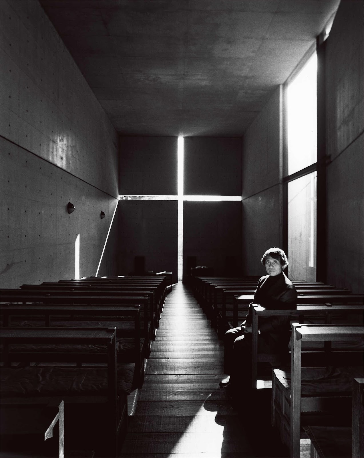
Church of the Light by Tadao Ando.
Few buildings demonstrate the power of monochrome as clearly as the Church of the Light. Its defining feature- a cross-shaped opening, relies entirely on contrast. In black-and-white photography, the contrast between solid concrete and light is very clear. Colour would soften this effect, but in black and white, the space is easy to see and understand, showing the architect’s focus on light as the main design element.

Church of the Light by Tadao Ando, 1989. Photo credit: Nobuyoshi Araki.
Across these examples, black-and-white photography consistently reveals architectural intent. It reduces visual noise and allows form, proportion, and light to guide interpretation.
This approach isn’t just unique to architecture, fields like fashion, product design, and film use monochrome for similar reasons: to focus attention on form, contrast, and structure. Culturally, black-and-white imagery signals intention. It asks viewers to slow down and engage rather than scroll past. In a visually saturated world, that restraint feels increasingly relevant.
Monochrome photography reminds us that architecture’s power often lies beneath finishes and colour palettes. By removing what is decorative, it reveals what is essential.
For architects, it remains a vital analytical tool. For viewers, it offers a clearer way to understand buildings beyond surface appeal, and for anyone willing to look closely, black-and-white images show that architecture’s true character is often revealed not by what is added, but by what remains when everything else is stripped away.
